KitSplit
Product Designer / 2018 - 2019
From 2018 - 2019, I was the product designer at KitSplit, a camera rental marketplace. My work focused around user research, UX wireframes, and interface design.
I designed billboards for KitSplit that were installed all around Los Angeles in August 2018.
Because many people are not familiar with KitSplit yet, featuring the logo and the KitSplit brand color yellow were both high priorities. We worked with illustrator Michele Rosenthal to develop a simple graphic that could visually symbolize what KitSplit does.
LA Billboards
I designed billboards for KitSplit that were installed all around Los Angeles in August 2018.
Because many people are not familiar with KitSplit yet, featuring the logo and the KitSplit brand color yellow were both high priorities. We worked with illustrator Michele Rosenthal to develop a simple graphic that could visually symbolize what KitSplit does.

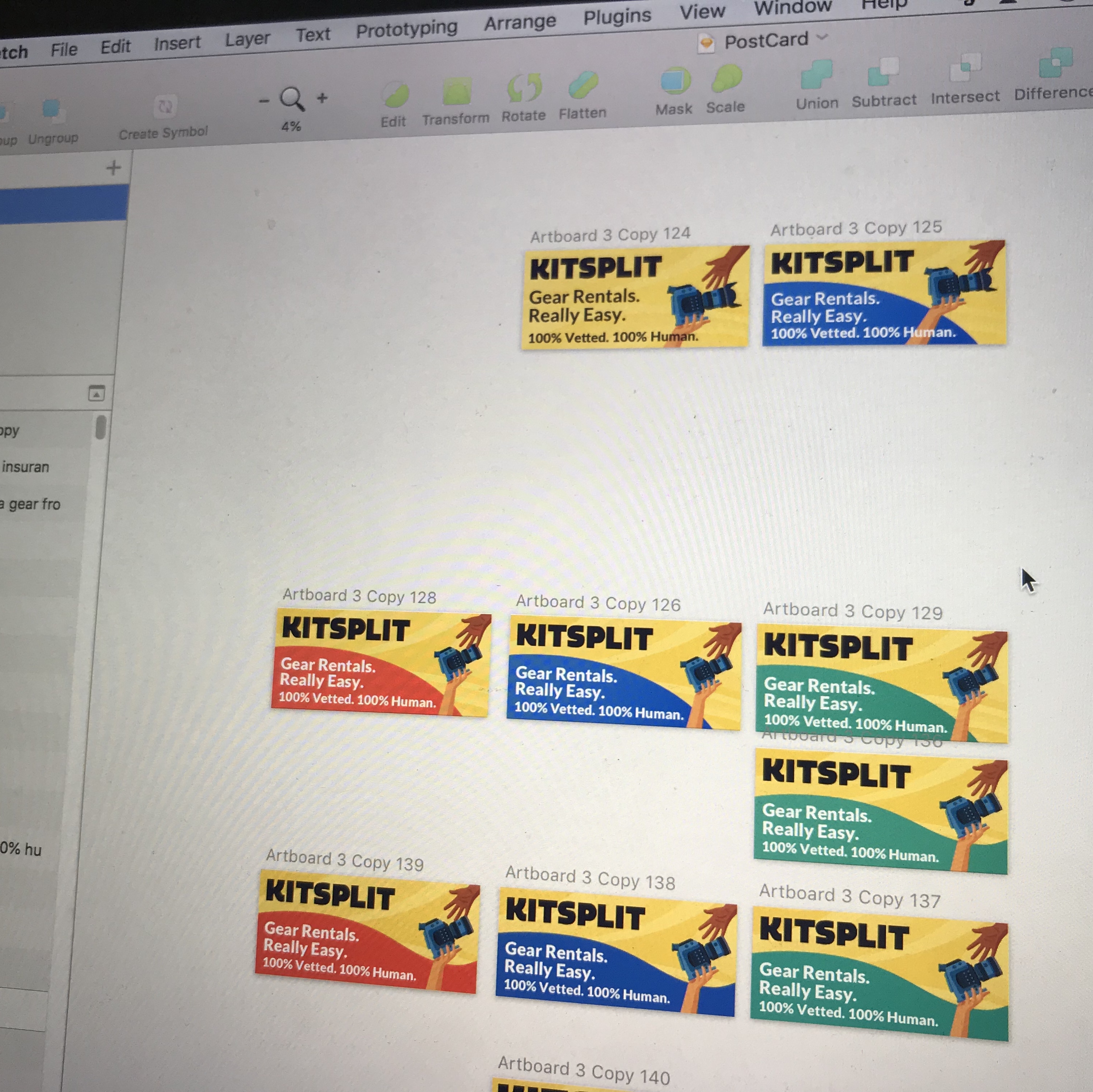
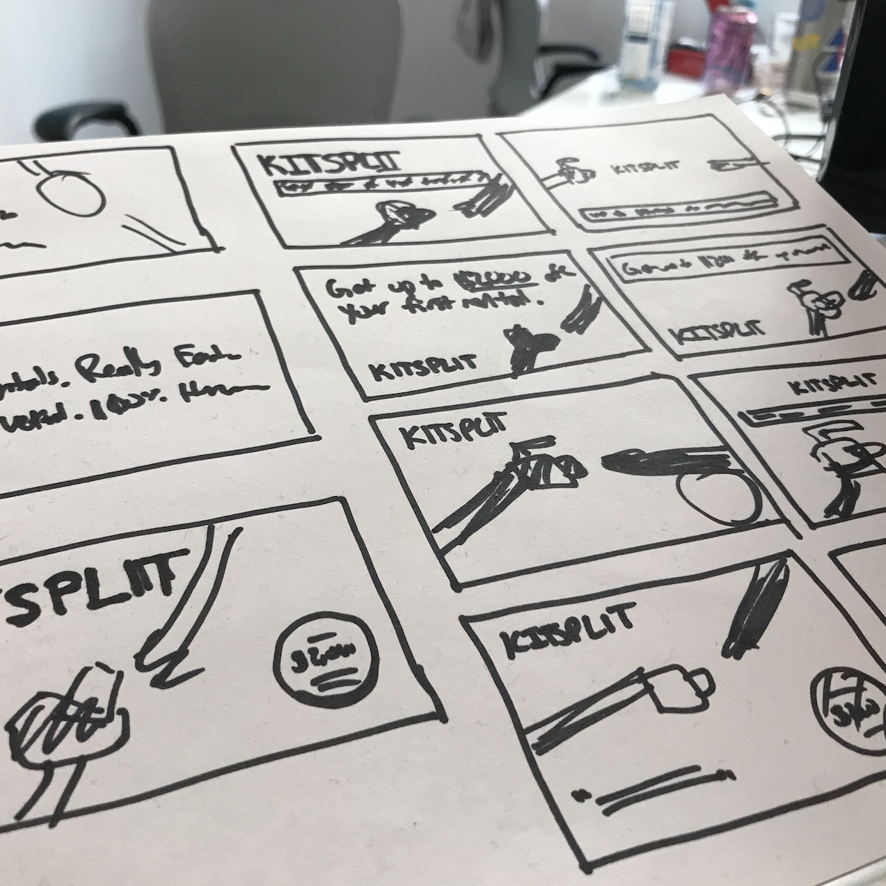
Process Shots

Search Results
One of the first projects I worked on for KitSplit was redesigning the search results page on the web platform, with a specific focus on the listing results themselves.
The biggest issue with the old search results page was the lack of content density the results contained. Unlike platforms such as Airbnb, not all KitSplit results are unique; a few people are often renting out the same camera, with slight variations. From user interviews (and my own experience), I learned that filmmakers searching on KitSplit are often looking for very specific things — it’s rare that they are just casually browsing, as one might do on Yelp.
Because of this, it’s vital that our search results page surface as much information possible to allow users to quickly scan and find the listings that might work for them.
Old Search Results Page

In the old search results, the majority of listings had titles too long to be viewed. In addition, there was no way to see more information on the listings and what they might include without opening a new page.
I redesigned each results module to be full-width across the page. This allowed us to surface the entirety of listing titles (farewell, ellipses!) and include more information on each listing, such as a description of what each result includes.
Because users now had access to much of the information they may need to see before deciding on a piece of gear, we also decided to add primary calls to action on each results module, such as the ability to message owners about the item or even the ability to check out.
Because users now had access to much of the information they may need to see before deciding on a piece of gear, we also decided to add primary calls to action on each results module, such as the ability to message owners about the item or even the ability to check out.
Old Listing Result
![]()

New Listing Result
![]()

New Search Result Page
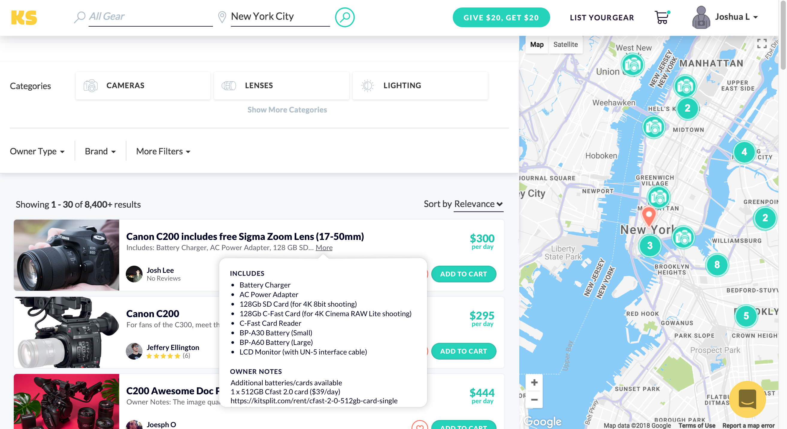
The new search results page surfaces much more listing information, adds primary calls to action, and the ability to hover to see more information about the gear.